Charlotte Jonckheer 1:PAPER / Paper Through Change:
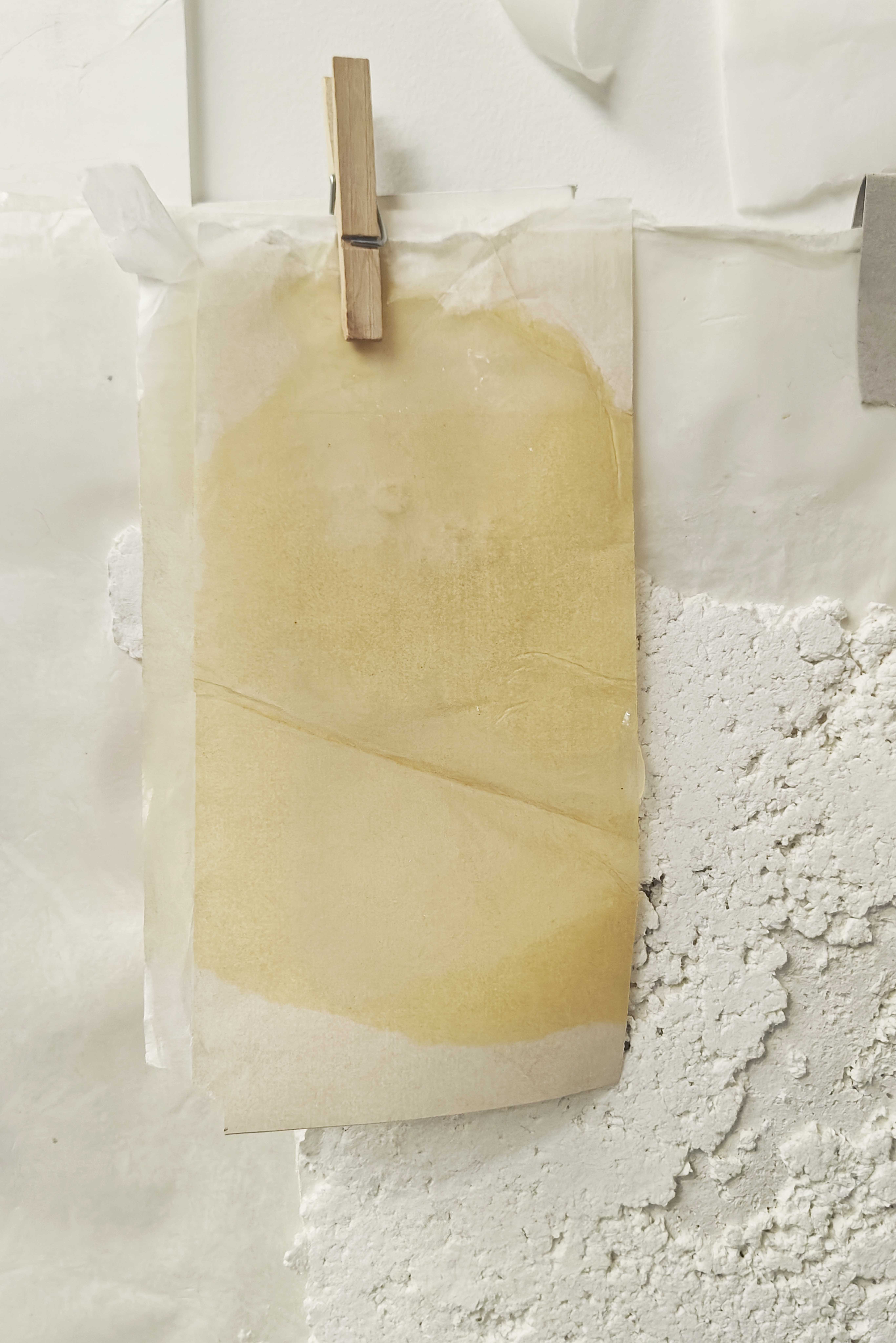
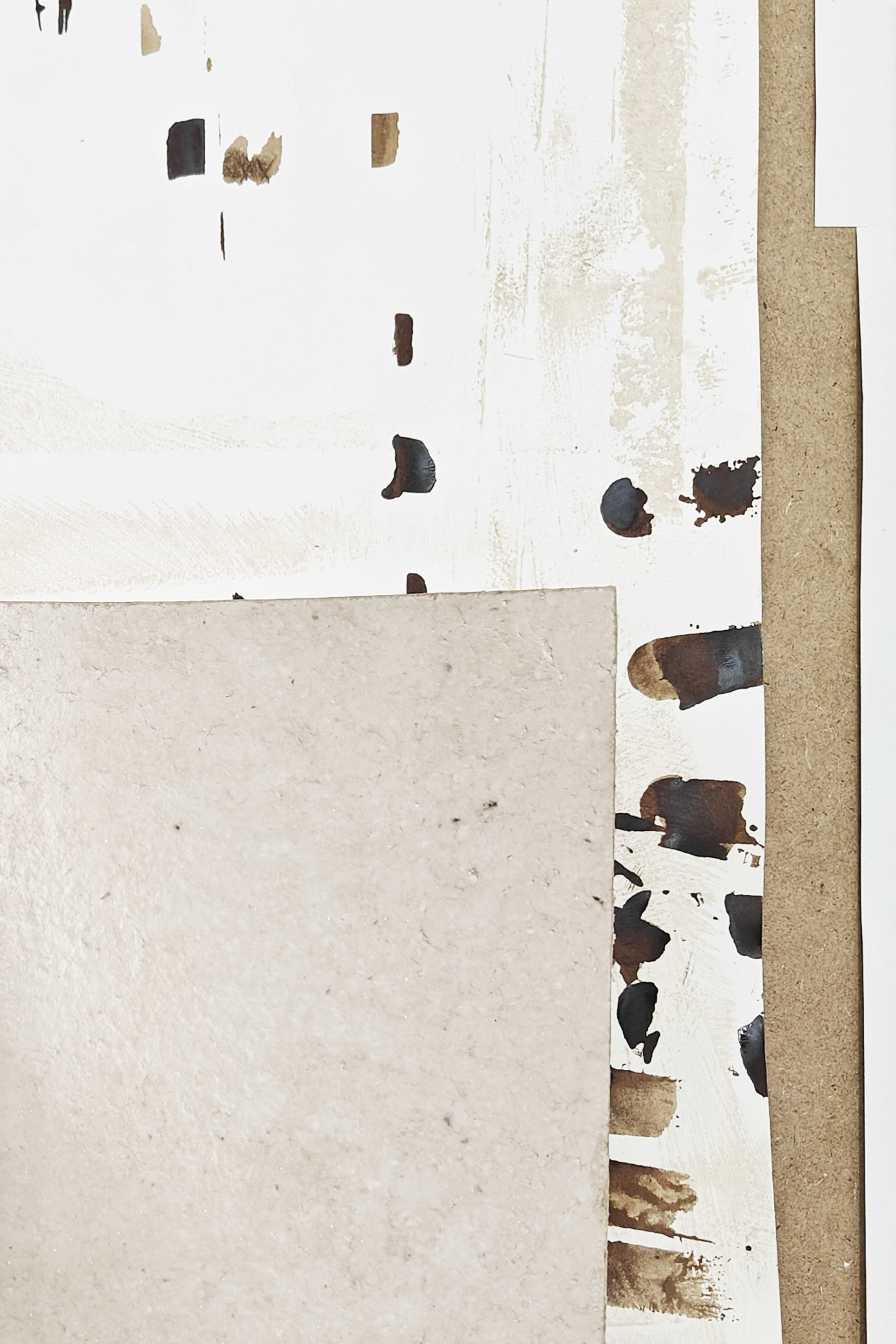
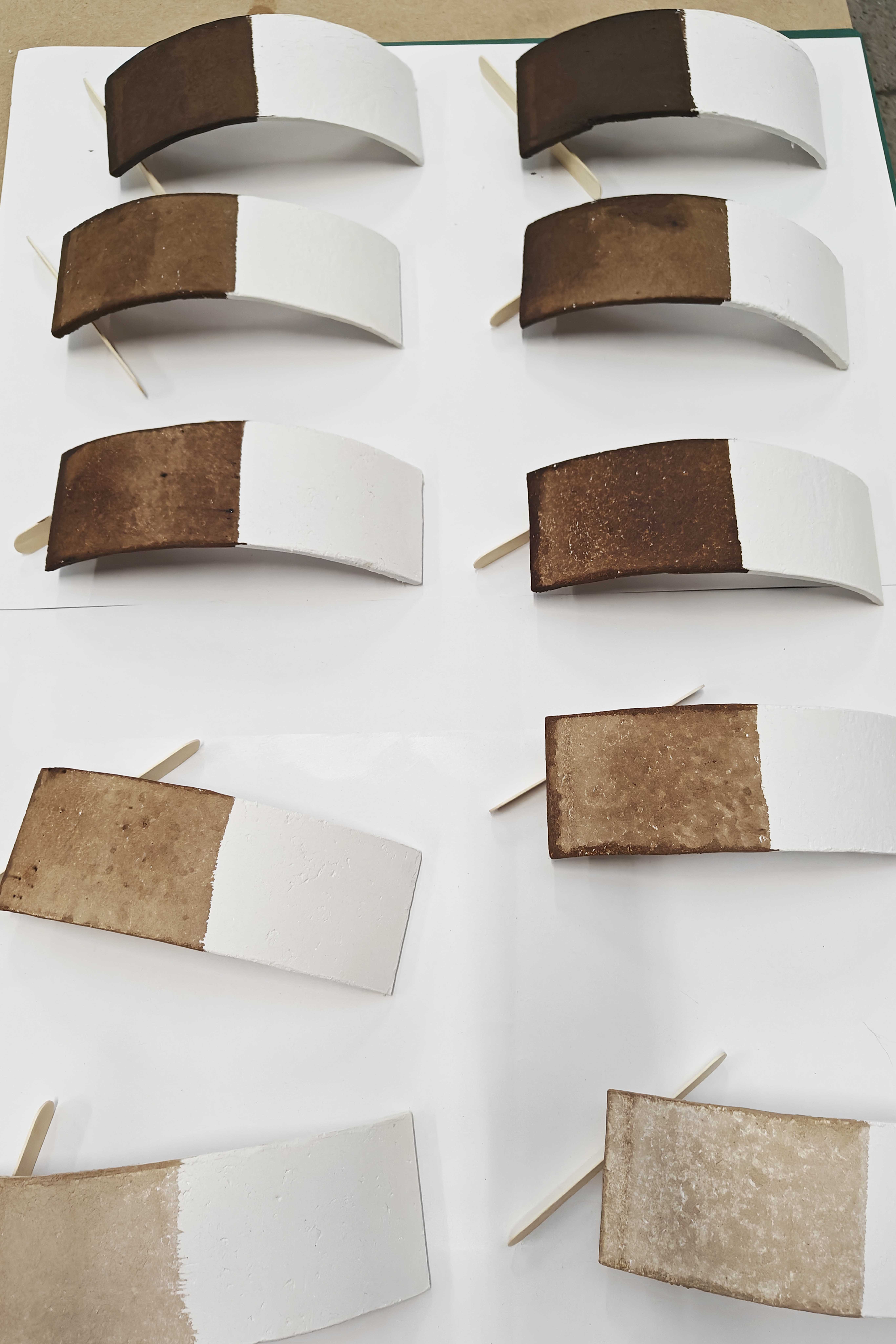
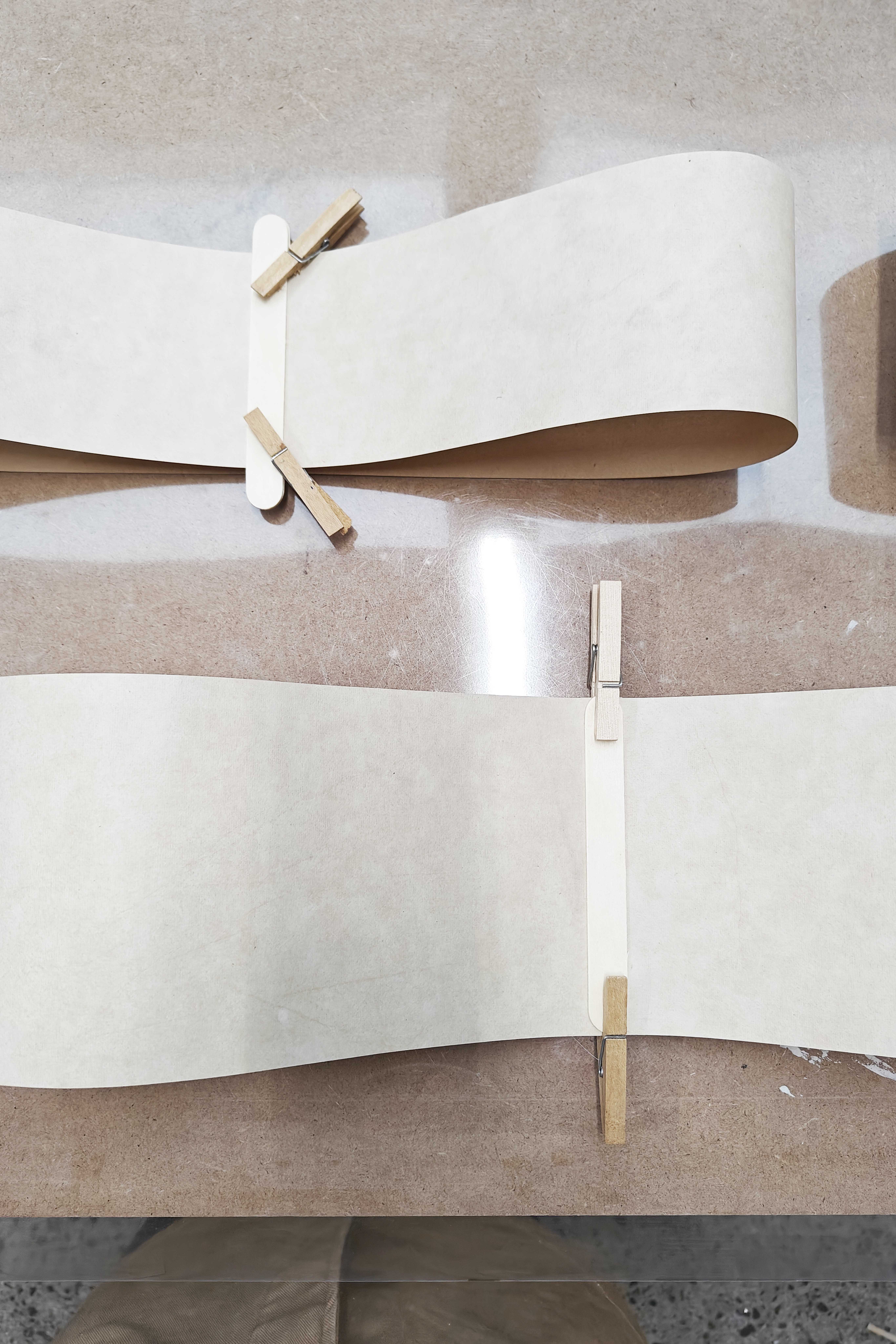
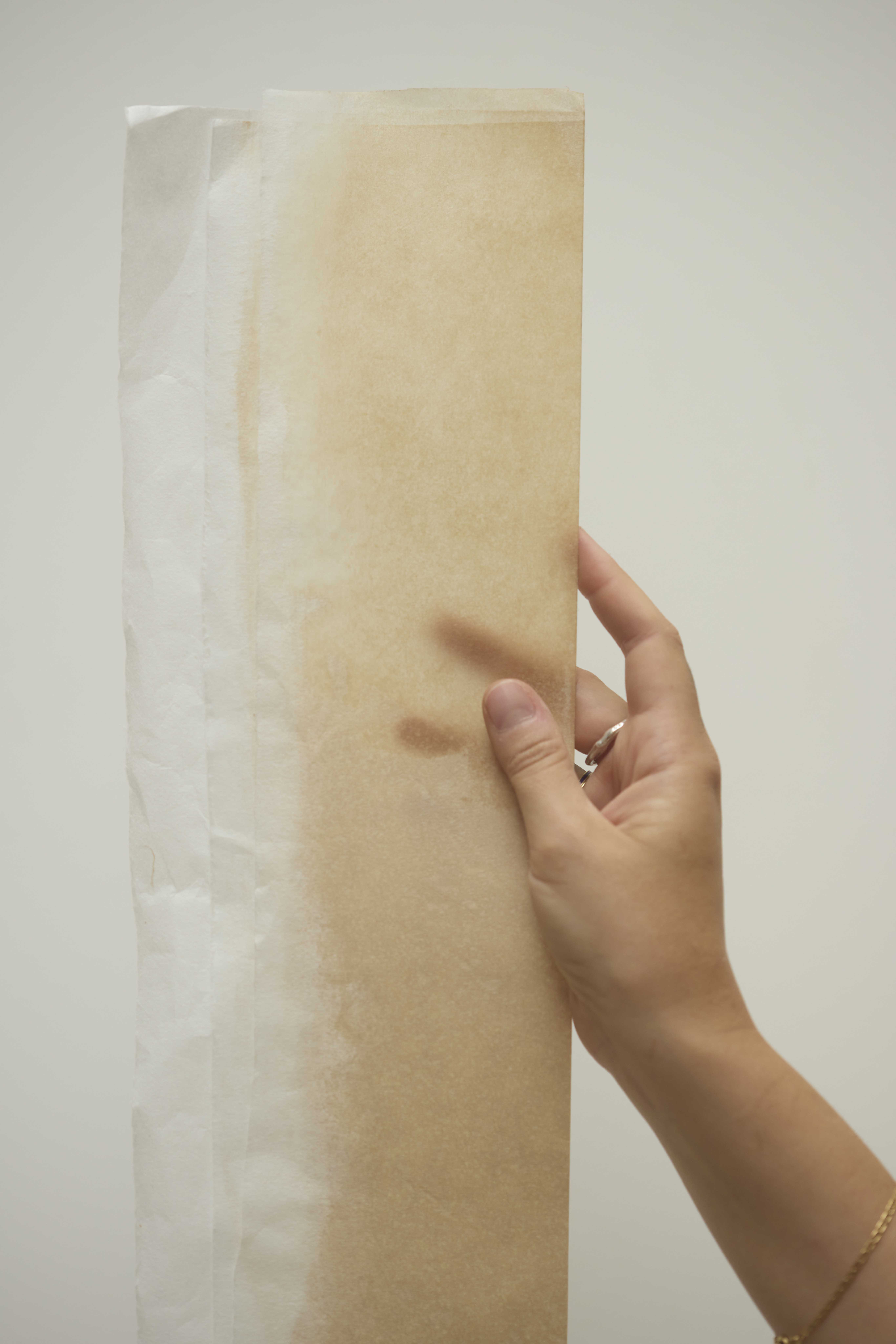
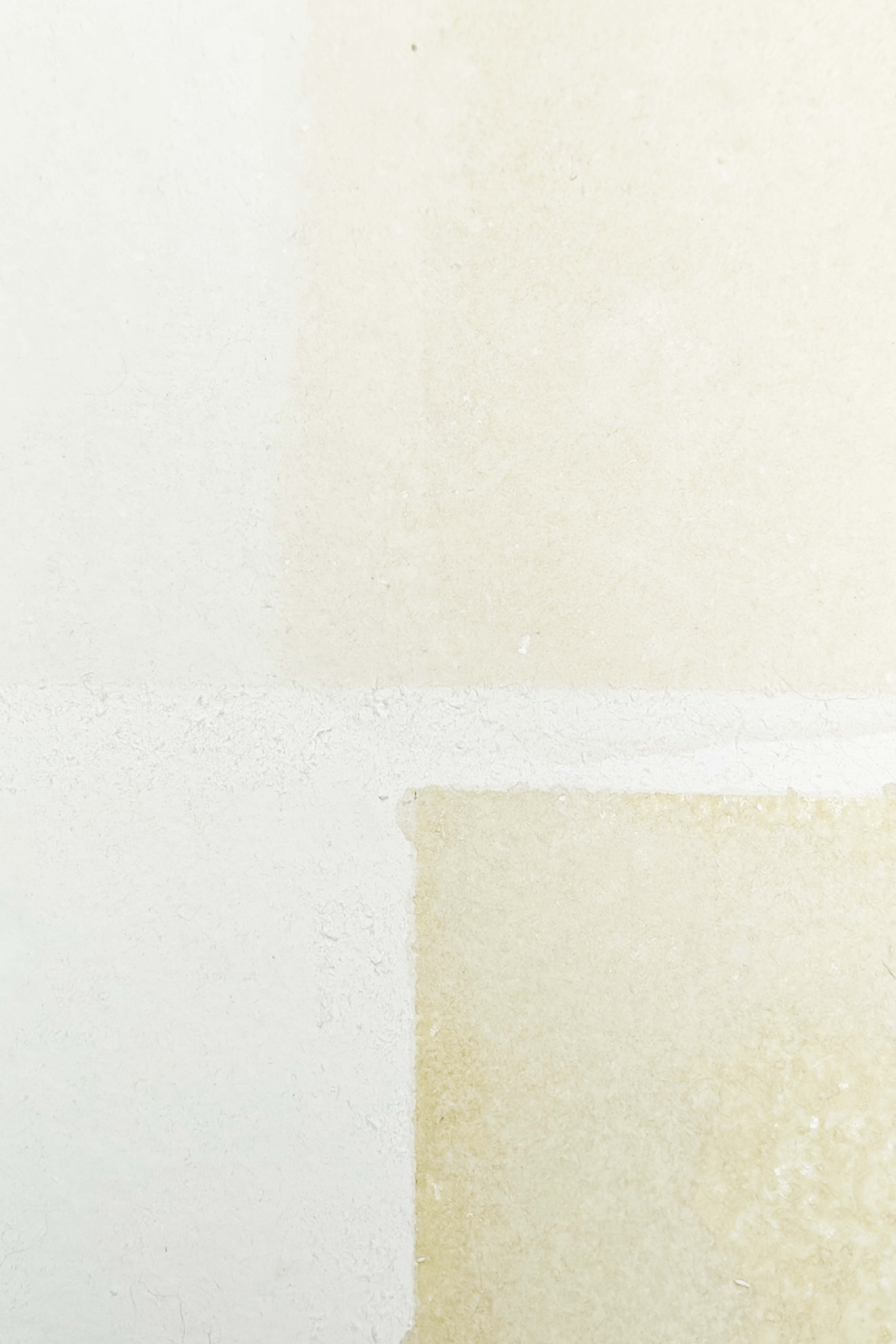
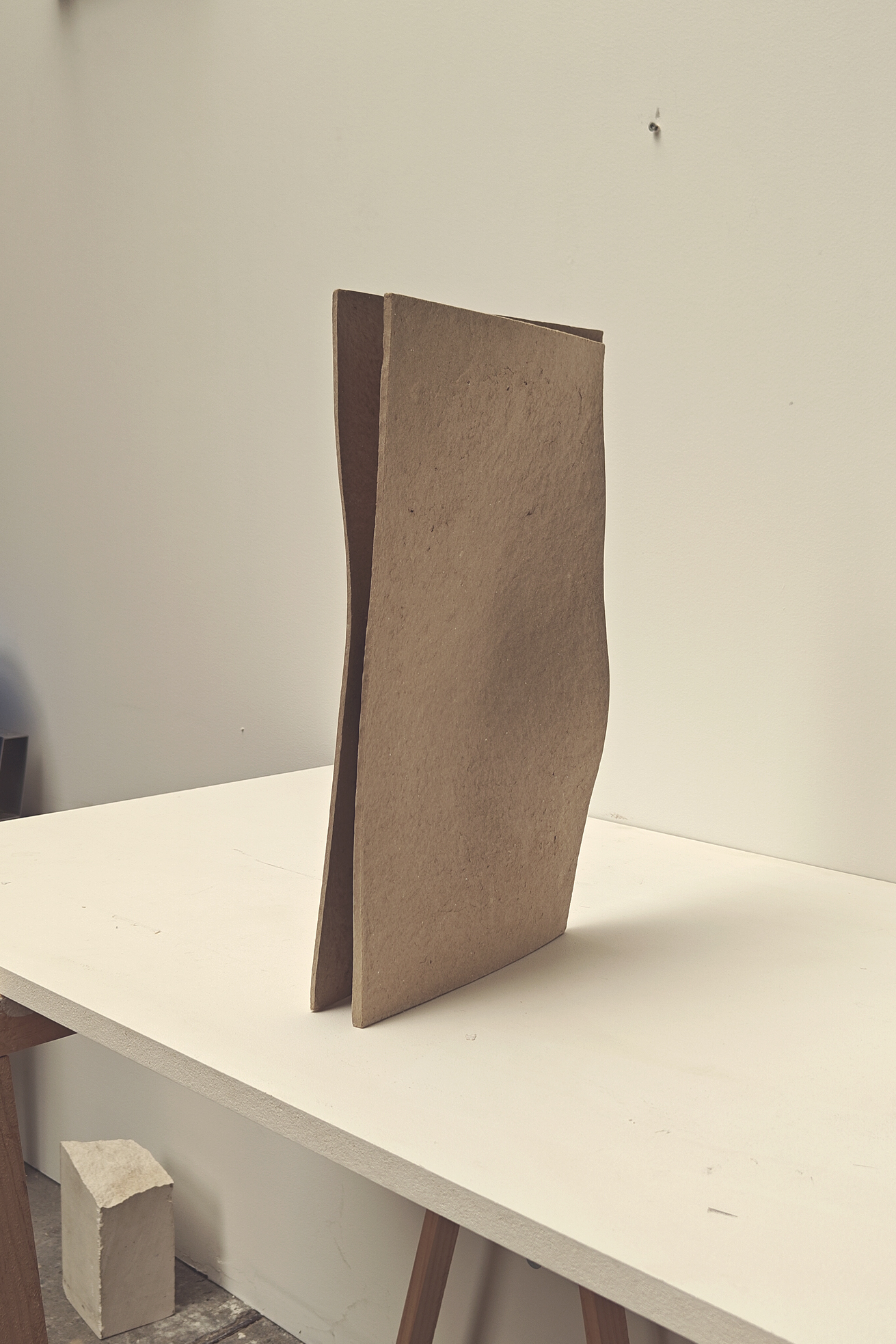
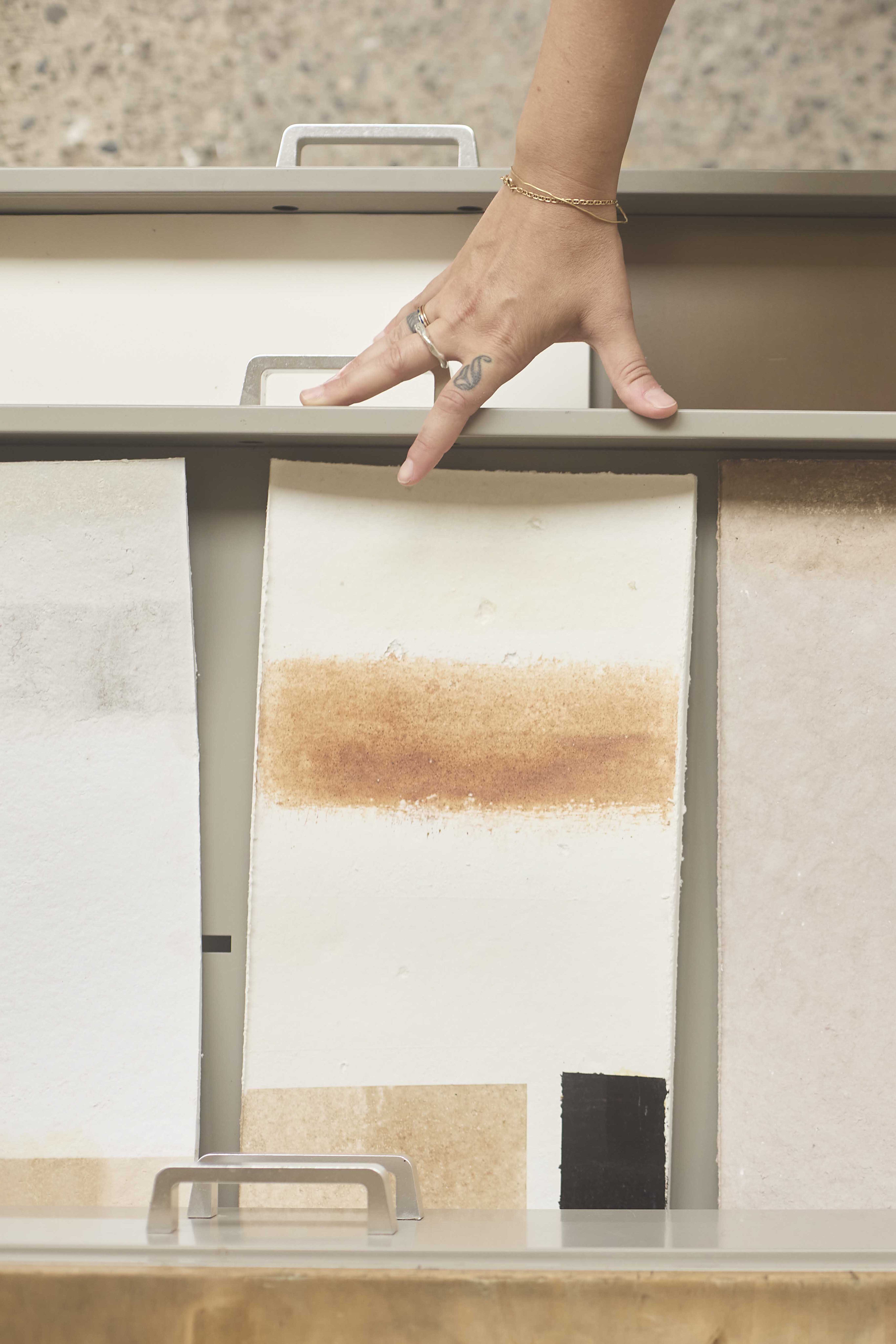
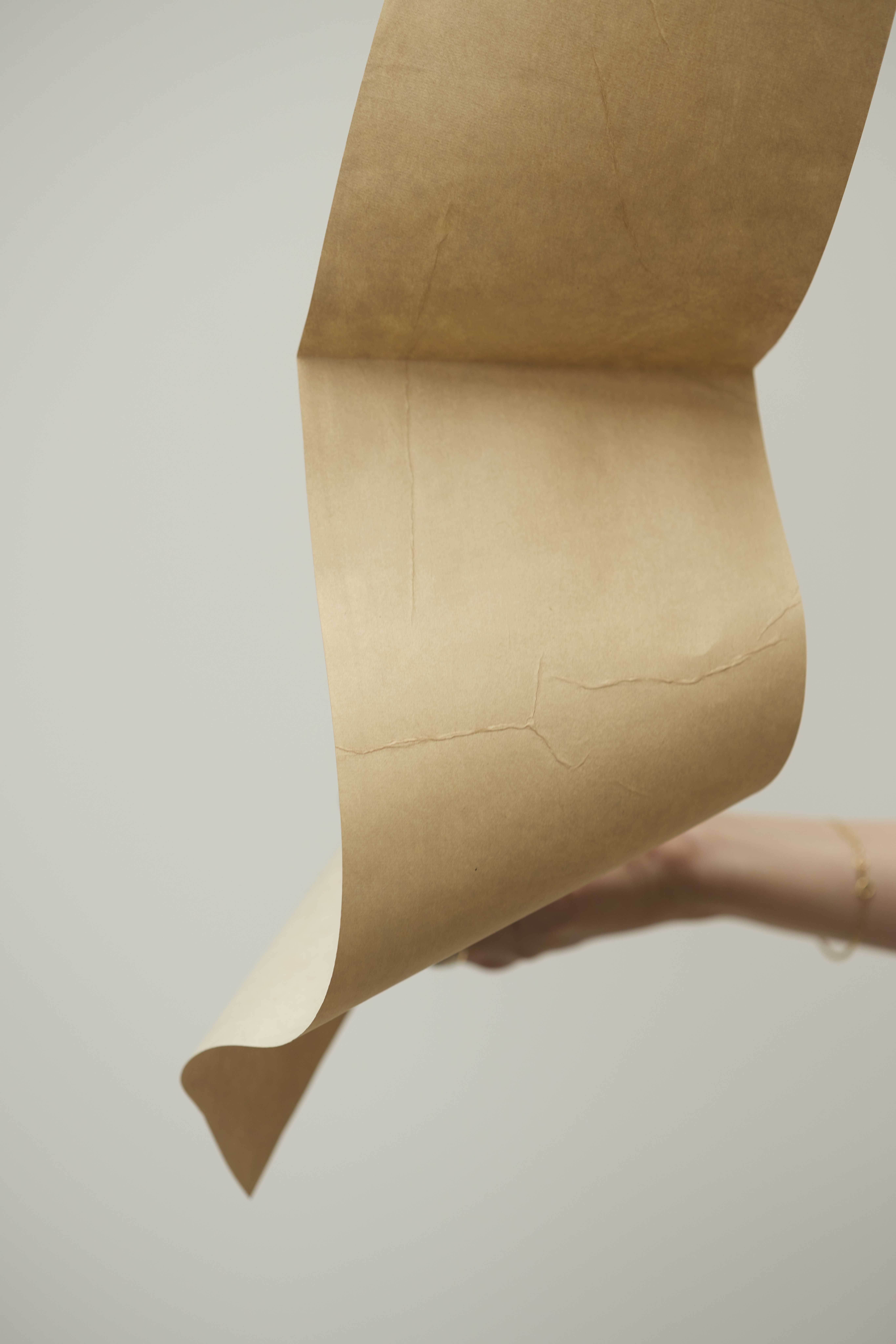
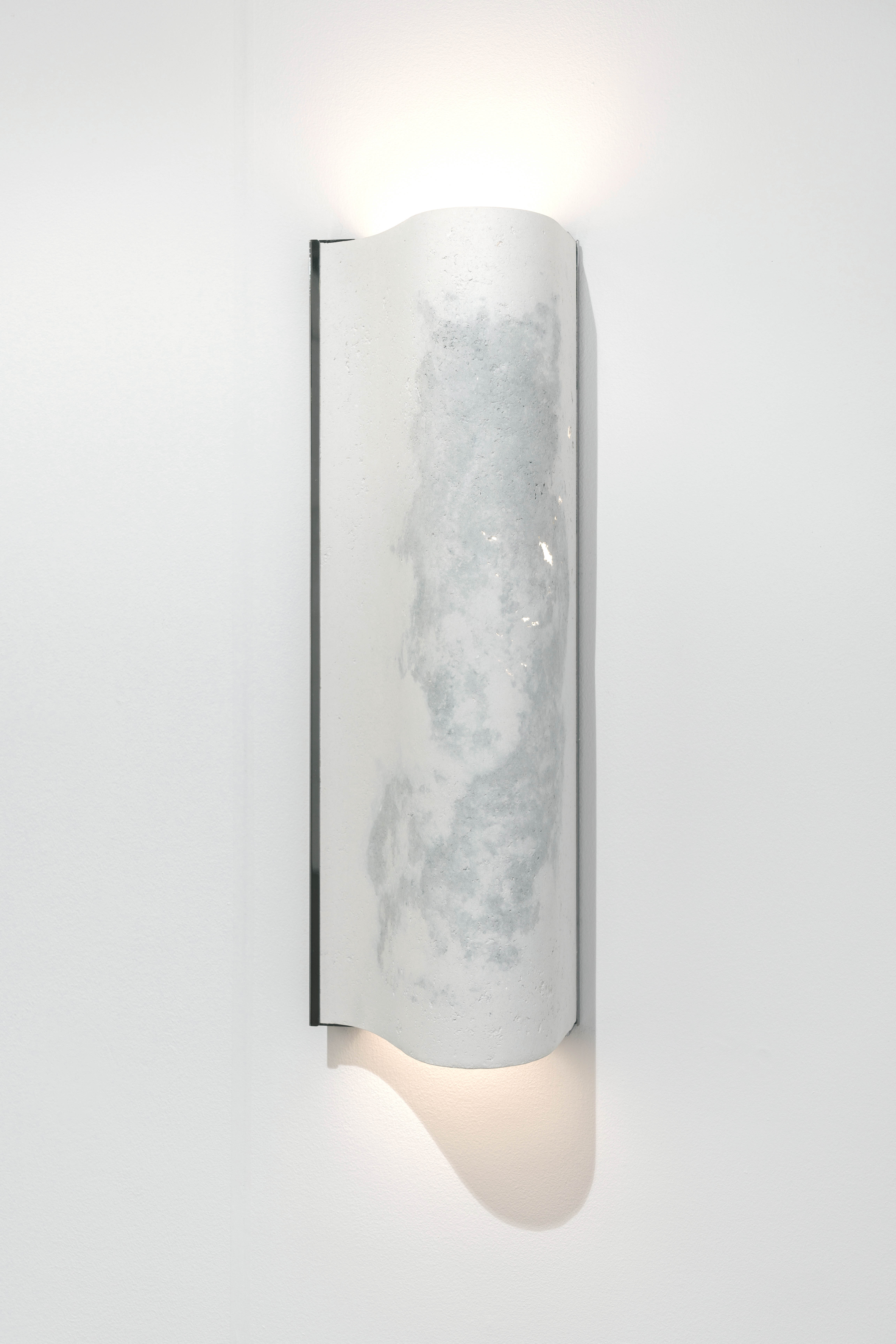
I usually work with the natural colours of materials, but in my latest work I have been conducting broader artistic and theoretical research into the colours yellow and brown in relation to paper and our perception of time. While these colours often evoke fragility and ageing, suggesting that the material is brittle and worn, they can also be associated with strength and resilience when combined with natural coatings that reinforce the material. Some of the pieces shown here follow this principle. I use a biodegradable, linseed-based coating that seals the surface and gives it a subtle yellow glow (see IM and the Glazed Paper Lamps). I also work with walnut ink, which strengthens the paper thanks to its high tannin content (see the Full Paper Table and the Walnut Lamp). A similar tradition has existed in Japan for centuries: Kakishibu, a fermented persimmon coating also rich in tannins, is used to impregnate paper and make it weather-resistant. Walnut-based ink is used in both the Glazed Paper Lamp and the Full Paper Table, imparting not only a deep brown tone, but also considerable strength to the paper surface.
Although yellow and brown are often associated with ageing and fragility, they can also evoke a sense of strength and protection. This shift in thinking reveals a new approach, one that embraces change in paper rather than resisting it.
